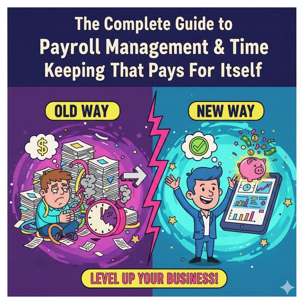
The $45,000 Website That Got Zero Visitors (And What We Learned)

The $45,000 Website Nobody Found
Law firm called us, frustrated and embarrassed.
Them: "We spent $45,000 on a new website. It has been live for 6 months. We have gotten exactly 3 inquiries."
Me: "How much traffic are you getting?"
Them: "About 12 visitors per day."
Me: "Let me guess—the agency showed you mockups, you loved the design, they built it, launched it, and disappeared?"
Them: "...exactly."
Their website was stunning. Award-worthy design. Beautiful photography. Smooth animations.
It was also:
- Invisible to Google (zero SEO optimization)
- Slow as hell (4.8 second load time)
- Mobile experience was garbage
- Zero call-to-action strategy
- Content written by designers (not for humans or search engines)
That $45K investment generated: 3 inquiries in 6 months
After we fixed it (3 months later): 47 qualified leads per month
Same website. Different strategy.
Here is everything we learned from rescuing 31 failed website launches.
The Truth: Pretty Websites Do Not Make Money
The Harsh Reality
Beautiful design ≠ Business results
We have seen:
- Gorgeous websites with zero traffic
- Ugly websites that print money
- Award-winning designs that convert at 0.3%
- Basic sites that convert at 8%
The difference? Strategy over aesthetics.
What Actually Drives Results
1. People can FIND it (SEO, speed, mobile)
2. People TRUST it (professional, clear, credible)
3. People UNDERSTAND it (clear value prop, simple navigation)
4. People ACT on it (strong CTAs, easy contact, no friction)
Pretty is nice. Results are required.
The 5 Website Mistakes Costing You Money Right Now
Mistake 1: Your Website is Invisible to Search Engines
The problem:
Builder/designer focuses on looks. Launches site. Wonders why nobody visits.
Why it happens:
- No keyword research before building
- Page titles are generic ("Home", "Services", "About")
- URLs are terrible ("/page?id=123" instead of "/web-design-services")
- Images have no alt text
- Content is thin (200 words per page)
- No blog or fresh content
- Technical SEO ignored
Real example:
Accounting firm website. Beautiful design. Google ranking for their name: Page 1. Ranking for "accounting services [their city]": Not in top 100.
Translation: Only people who already know them can find them. Zero new customer discovery.
What we fixed:
Before:
- Homepage title: "Home - ABC Accounting"
- Products page: /products
- Content: 180 words of generic fluff
- Blog: None
- Google Search Console: Not installed
- Monthly organic visitors: 23
After (90 days):
- Homepage title: "Small Business Accounting Services in [City] | ABC Accounting"
- Services page: /small-business-accounting-services
- Content: 1,800 words covering specific services
- Blog: 2 posts/month answering client questions
- Google Search Console: Monitored daily
- Monthly organic visitors: 340
Leads per month: 2 → 18
Cost to fix: $4,200
ROI: First month
Mistake 2: Your Website Loads Like It is 2010
The brutal truth:
If your site takes more than 3 seconds to load, 53% of mobile users have already left.
Real disaster:
E-commerce site selling custom furniture. Gorgeous product photography. High-resolution images. Beautiful sliders.
Load time: 8.4 seconds
Bounce rate: 76%
They blamed: "People just are not interested in custom furniture anymore."
Actually: Their slow website was killing sales.
What we discovered:
Their images:
- 6MB per image (should be under 200KB)
- Not compressed
- Not optimized for web
- Not lazy-loaded
- No next-gen formats (WebP)
Fix we implemented:
- Compressed images (6MB → 180KB, no visible quality loss)
- Implemented lazy loading
- Added WebP format with fallbacks
- Optimized code (removed unused CSS/JS)
- Enabled browser caching
- Set up CDN
Results:
- Load time: 8.4s → 1.9s
- Bounce rate: 76% → 34%
- Conversion rate: 1.2% → 3.8%
- Revenue: Up 185% in 4 months
Same products. Same prices. Faster website.
Mistake 3: Mobile Experience is an Afterthought
The stat that kills:
63% of Google searches happen on mobile devices.
What we see constantly:
- Desktop site looks great
- Mobile site is a disaster
- Tiny text (requires zooming)
- Buttons too small to tap
- Horizontal scrolling required
- Pop-ups cover content
- Forms do not work on mobile
Real example:
Restaurant website. Desktop: Beautiful, clean, easy to navigate.
Mobile: Menu was a PDF that required pinch-and-zoom. Reservation button was impossible to tap. Hours were buried in footer.
Result: People would visit site on phone, give up, call competitor instead.
The fix:
- Mobile-first design (design for phone FIRST, then scale up)
- Touch-friendly buttons (minimum 48×48 pixels)
- Readable text without zooming (16px minimum)
- Simple, thumb-friendly navigation
- Click-to-call phone number
- Mobile-optimized forms
Results:
- Mobile bounce rate: 68% → 29%
- Phone call conversions: Up 340%
- Online reservations: Up 190%
Owner: "We thought people did not use phones to browse restaurants. Turns out they do when the site actually works."
Mistake 4: No Clear Call-to-Action (What Do You Want Me To Do?)
The problem:
Visitor lands on site. Looks around. Leaves. No idea what action to take.
Common failures:
- No CTA buttons
- CTA buried at bottom
- Generic CTAs ("Learn More", "Click Here")
- Too many options (paradox of choice)
- Contact form requires 15 fields
Real example:
B2B software company. Homepage had:
- "Learn More" button
- "Get Started" button
- "Request Demo" button
- "Download Whitepaper" button
- "Contact Sales" button
- "Free Trial" button
Visitor decision: Analysis paralysis → Leave
Conversion rate: 0.9%
The fix:
One primary CTA per page.
Homepage: "Schedule a Free Demo" (that is what drives sales)
Pricing page: "Start Free Trial"
Blog posts: "Get Our Free Guide"
Results:
- Reduced choices from 6 to 1 primary + 1 secondary
- Made CTA buttons stand out (contrasting color)
- Simplified contact form (3 fields instead of 15)
- Added urgency ("Join 500+ companies using [Product]")
Conversion rate: 0.9% → 4.2%
Demo requests: 12/month → 71/month
Same traffic. Different results.
Mistake 5: Content Written by Designers (Not Marketers)
The horror:
"We create innovative solutions leveraging cutting-edge technology to deliver synergistic outcomes that maximize stakeholder value."
Translation: Nobody knows what you actually do.
Real example:
SaaS company homepage. 400 words of corporate jargon. Zero mention of what problem they solve.
Visitor experience: Read entire homepage. Still confused about what the product does. Leave.
What actually works:
Lead with the problem you solve:
Bad: "Innovative cloud-based workflow optimization platform"
Good: "Stop losing deals because your sales team cannot find the right proposal"
Use normal human language:
Bad: "Leverage our proprietary algorithm to optimize conversion"
Good: "Get more customers from the same traffic"
Show, don't just tell:
Bad: "Increase productivity"
Good: "Save 6 hours/week on admin tasks"
Real transformation:
Replaced 600 words of jargon with 300 words of clear benefit-driven copy.
Bounce rate: 61% → 38%
Time on page: 22 seconds → 2 minutes 14 seconds
Conversion rate: 1.4% → 3.9%
Owner: "Our sales team stopped having to explain what we do. The website does it now."
What To Actually Do: The Strategy That Works
Step 1: Keyword Research (BEFORE Design)
Wrong order: Design site → Write content → Hope for traffic
Right order: Research what people search → Build site around those topics → Get traffic
Tools we use:
- Google Keyword Planner (free)
- Ubersuggest (free/cheap)
- AnswerThePublic (free)
- Actual customer conversations (priceless)
Example:
Roofing company thought people searched "roofing services"
Actually searched:
- "roof leak repair near me" (3,200/month)
- "how much does roof replacement cost" (1,900/month)
- "roof repair vs replacement" (820/month)
Built content around ACTUAL searches → Traffic increased 440%
Step 2: Speed Optimization (Required, Not Optional)
Target: Under 2.5 seconds load time
How:
- Compress images (use TinyPNG, ShortPixel)
- Use WebP format
- Lazy load images
- Minimize code
- Enable caching
- Use a CDN
- Choose fast hosting
Test with: Google PageSpeed Insights
Aim for: 90+ score on mobile AND desktop
Step 3: Mobile-First Design
Design process:
- Design for phone screen FIRST
- Then adapt for tablet
- Then adapt for desktop
Not the reverse.
Why: Forces you to prioritize. What MUST be on mobile? That is what matters most.
Step 4: Clear Conversion Path
Every page should answer:
- Where am I? (clear headline)
- What can I do here? (value proposition)
- Why should I care? (benefits)
- What should I do next? (CTA)
Formula:
- Above fold: Headline + benefit + CTA
- Middle: Social proof (testimonials, logos, stats)
- Bottom: Secondary CTA
Step 5: Content That Ranks AND Converts
Structure:
- H1: Main keyword (only one per page)
- H2s: Section keywords
- First paragraph: Include main keyword naturally
- Throughout: Answer questions people actually ask
- Images: Optimized with descriptive alt text
- Links: Internal linking to related pages
Length: As long as needed to cover topic completely. Usually 1,500+ words for important pages.
Frequency: Blog 1-2x per week minimum for growth
Real Results From Real Businesses
Law Firm
Before:
- $45K website, zero SEO
- 12 visitors/day
- 3 inquiries in 6 months
After (3 months):
- SEO optimization
- Speed improvements
- Content strategy
- Clear CTAs
Results:
- 340 visitors/day
- 47 qualified leads/month
- 12 new clients/month (avg value: $15K)
- ROI: 1,200%
E-Commerce (Custom Furniture)
Before:
- Beautiful design
- 8.4s load time
- 76% bounce rate
- 1.2% conversion
After (2 months):
- Speed optimization
- Mobile improvements
- Simplified checkout
Results:
- 1.9s load time
- 34% bounce rate
- 3.8% conversion
- Revenue: +185%
B2B SaaS
Before:
- Confusing messaging
- 6 different CTAs
- 0.9% conversion
- 12 demos/month
After (6 weeks):
- Clear value proposition
- Single primary CTA
- Simplified forms
Results:
- 4.2% conversion
- 71 demos/month
- Sales pipeline: +490%
The Website Checklist
Before you launch (or relaunch):
SEO:
- Keyword research completed
- Page titles optimized (unique, keyword-rich)
- Meta descriptions written
- URLs are clean and descriptive
- Heading structure (H1, H2, H3) logical
- Images have alt text
- Internal linking strategy
- Google Search Console set up
- Google Analytics installed
Performance:
- Load time under 2.5 seconds
- Images compressed and optimized
- Mobile PageSpeed score 90+
- Desktop PageSpeed score 90+
- No render-blocking resources
Mobile:
- Tested on real devices
- Text readable without zooming
- Buttons easy to tap
- Forms work smoothly
- No horizontal scrolling
- Pop-ups do not cover content
Conversion:
- Clear value proposition on homepage
- Primary CTA on every page
- Contact forms simple (3-5 fields max)
- Phone number click-to-call
- Trust signals (testimonials, logos)
- No broken links
Content:
- Written in plain language
- Benefits over features
- Answers customer questions
- Blog strategy in place
- Regular content calendar
The Bottom Line
Your website should:
- Be found by people searching for your services (SEO)
- Load in under 3 seconds (speed)
- Work perfectly on phones (mobile-first)
- Clearly communicate value (messaging)
- Make it easy to take action (conversion)
If yours does not do all five, it is not a business asset. It is an expensive art project.
Ready for a Website That Actually Works?
We have rescued 31 failed website launches and built 50+ sites that actually drive business growth.
Our web design approach:
- SEO-first (keyword research before design)
- Speed-optimized (under 2.5s load times)
- Mobile-first responsive design
- Conversion-focused (clear CTAs, simple forms)
- Content strategy included
- Training so you can update it yourself
Request a Free Website Audit to see exactly what is holding your site back.
Or explore our web design services to see how we build websites that get found and convert.
Let's Talk
Tell us what you need. No sales pitch, just a conversation.
Message sent!
We'll get back to you within 24 hours.
Something went wrong. Please try again.
Join the Waitlist
Be the first to know when we launch. No spam, just updates.
You're on the list!
We'll keep you posted on our launch.
Something went wrong. Please try again.
Powered by Dyna
👋 Hi, I'm Dyna! Need help choosing the right solution?